

 See My Latest Article on HelloNation
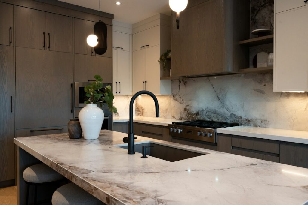
Choosing a stone color is more than matching a countertop to a paint swatch. The right choice depends on natural light, cabinet color, flooring, room size, maintenance expectations, and how the space is used. In Kernersville, NC, where homes may range from older kitchens with distinct architectural details to newer open-concept layouts, a useful color decision starts with the entire room rather than the countertop alone.
How should stone color be chosen?
Begin with the fixed elements that are staying in place. Cabinets, flooring, backsplash tile, wall color, and large appliances usually influence the countertop more than temporary decorations do.
A practical order is:
- Identify the undertone of the cabinets and flooring.
- Observe how much natural and artificial light reaches the room.
- Decide whether the countertop should blend in or provide contrast.
- Consider how visible crumbs, water spots, and everyday wear should be.
- Review large samples in the actual room before making a final selection.
Stone color is affected by its pattern, finish, slab size, and lighting. A sample that looks neutral in a showroom may appear warmer, cooler, lighter, or darker at home.
Which stone colors work well with common cabinet colors?
White, gray, wood, and painted cabinets each create different design conditions.
White cabinets can work with nearly any stone color, but the undertone matters. Cool white cabinets often pair well with gray, charcoal, black, or white stone with subtle gray movement. Warm white cabinets may look more natural with cream, beige, taupe, or stone containing soft brown and gold tones.
Gray cabinets generally pair well with white, charcoal, black, and muted blue-gray stone. If both the cabinets and countertop are gray, include enough contrast in value or pattern to prevent the room from looking flat.
Natural wood cabinets often look balanced with cream, beige, brown, soft white, or green-gray stone. Dark wood may benefit from a lighter countertop, while pale wood can support either a light stone or a deeper contrasting color.
Painted green, blue, or other colored cabinets usually need a more restrained countertop. White, warm gray, soft cream, or lightly patterned stone can keep the room visually organized. A heavily patterned countertop may compete with cabinets that already provide strong color.
Matching the exact cabinet color is not necessary. A countertop can coordinate through undertones instead. For example, a stone with a small amount of warm veining may connect a neutral surface to wood flooring without appearing brown overall.
Are light or dark countertops easier to live with?
Neither light nor dark stone is automatically easier to maintain. Each color hides some types of mess while revealing others.
Light-colored stone tends to make a room feel larger and brighter. It can disguise light dust and fine crumbs, but dark spills, coffee, tomato-based foods, and strong shadows may be easier to see.
Dark stone can add visual depth and contrast, especially in a large kitchen or bathroom. It may hide some stains and colorful food residue, but water spots, fingerprints, flour, and fine dust can stand out more clearly.
Mid-tone colors, such as taupe, greige, soft gray, or medium brown, often provide a visual compromise. Patterns with moderate variation can also make ordinary daily marks less noticeable than a perfectly uniform surface.
Color does not determine stain resistance by itself. The type of stone, surface finish, porosity, sealant, and cleaning habits also matter. A dramatic color should not be selected with the assumption that it requires no care.
How does natural light change stone color?
Natural light can change the appearance of a countertop throughout the day. A north-facing or shaded room may make colors appear cooler and darker. Strong southern or western light can emphasize warm tones and create glare on polished surfaces.
Homes with windows, skylights, or open floor plans may show more variation than a small enclosed room. A color that looks balanced in morning light may appear noticeably warmer in the afternoon.
To evaluate a stone accurately:
- Place a large sample near the cabinets and flooring.
- Look at it in morning, afternoon, and evening light.
- Turn on the room’s normal fixtures.
- Check the sample from standing height and from nearby work areas.
- Compare it beside permanent materials rather than against a white wall.
Small samples can be misleading because they do not show the full movement of veining or the overall balance of color. A broad sample gives a better impression of whether the pattern will feel calm, busy, bold, or repetitive across the room.
Should the countertop match the backsplash?
The countertop and backsplash should coordinate, but they do not need to be identical. Using the same material on both surfaces can create a continuous appearance, while contrasting materials can give the room more definition.
If the countertop has bold veining or strong color movement, a quieter backsplash usually creates better visual balance. If the countertop is mostly solid or lightly patterned, the backsplash can provide more texture or color.

A common mistake is choosing each material separately and discovering that both have competing patterns. Before selecting colors, compare the backsplash, cabinet finish, flooring, and countertop sample together. The goal is not for every surface to look the same; the goal is for the room to have a clear visual hierarchy.
What stone colors make a small room look larger?
Light and moderately reflective colors can make a small kitchen, bathroom, or laundry area feel more open. White, light cream, pale gray, and soft beige tend to reflect more light than very dark colors.
A small room can still use dark stone successfully if the surrounding elements provide enough brightness. Light walls, under-cabinet lighting, open shelving, or pale cabinetry can keep a dark countertop from making the space feel closed in.
Large patterns may appear overwhelming in a compact room, especially when there are many seams, corners, or short countertop sections. Subtle movement or a controlled pattern often provides a more consistent appearance.
Room size is only one factor. A large, high-contrast pattern may work well in a spacious open kitchen but feel visually crowded in a narrow work area.
What should be considered for homes in Kernersville?
Seasonal changes in the region can affect how a room feels. Bright summer light may emphasize glare and warm undertones, while shorter winter days may make cool or dark surfaces seem heavier. Kitchens that receive frequent family use may also show more crumbs, water, and food residue than a lightly used formal space.
Many households use kitchens for more than cooking. The countertop may serve as a workspace, homework surface, serving area, or gathering place. A color that looks attractive in a staged room should also be practical for the household’s daily routines.
Flooring deserves special attention in homes with open layouts. A countertop may be viewed from several rooms, so it should relate not only to the cabinets but also to nearby wood, tile, or resilient flooring. Looking at the surface from a distance can reveal whether the color connects the spaces or creates an abrupt transition.
What are common mistakes when selecting stone color?
The most common mistake is choosing from a small sample under unfamiliar lighting. Other frequent problems include:
- Matching only the countertop and cabinets while ignoring the flooring.
- Selecting a dramatic pattern without viewing a larger section.
- Assuming all white stone has the same undertone.
- Choosing dark stone without considering water spots and dust.
- Forgetting that polished and honed finishes reflect light differently.
- Relying on photographs, which may alter color balance and contrast.
- Treating trendy colors as permanent preferences without considering long-term use.
A good color choice should still feel comfortable after the initial excitement fades. Neutral does not have to mean plain, and bold does not have to mean difficult. The most successful selections usually connect several existing elements while leaving enough contrast for the room to remain visually clear.
How can the final color decision be tested?
Place the largest available sample in the room and live with it for several days. View it beside cabinet doors, flooring, wall paint, appliances, and hardware. Observe it under daylight, ceiling fixtures, and under-cabinet lighting.
Also consider the direction of visual attention. If the room already has detailed flooring, decorative tile, or strongly grained cabinets, a calmer stone may be more suitable. If the rest of the room is simple, the countertop can provide controlled pattern and character.
The right stone color is the one that supports the room’s light, materials, and daily use without demanding attention from every angle. A careful comparison in the actual space is more reliable than choosing based on a showroom display or a single photograph.